Fake Art School: 002 Elements, Values
Fake Art School is my attempt at learning from the old masters using primary sources freely available on the internet. Download the book from the link below and join in! Discuss and share your work on Twitter.
Textbook: Elements of pen-and-ink rendering Assignment: §1 pp. 2-6, Values (PDF pp. 20-24)
Chapter Overview
Value was touched on in the introduction. This chapter give more detail and some exercises to do. We start with two simple drawings that show values being used in different ways.
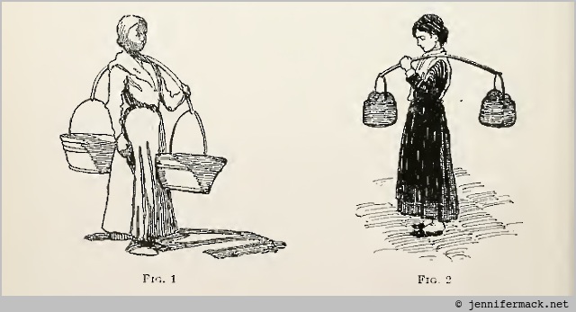
In rendering a drawing we employ different values; that is to say, different degrees of light and shade, as, for instance, black, gray (or half tone), and white. These three values may be used to represent simple light and shade, as in Fig. 1, where white and gray alone are used, giving a drawing in two values. Values are also used to express differences of color in the objects they represent, as shown in Fig. 2.
Fig. 1 give us detail, but no idea of coloring. The girl’s scarf is simply an outline. In fig. 2 we can use the difference of value to see that her scarf and apron are different colors. The author points out that choosing a rendering style is a personal preference for the artist.
Also, the first drawing shows directionality of light which adds visual interest. Without the light it would be flat and boring. The second doesn’t show either direction or strength of light. The visual interest is added by the texture adding “color” to the drawing.
The value scale
The author suggests that three values, plus black and white, are enough to render a scene in ink.
A scale of five values should also be practiced, however, so as to give power to depict an object more fully than can be done with three tones, but in pen-and-ink rendering a scale of more than five values is difficult to use and seldom necessary.
He then provides a sample scale.
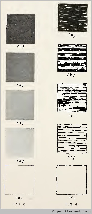
The scale on the left is done with a brush as an ink wash ranging from undiluted black to the white of the paper. The middle three tones are approximately 25%, 50%, and 75% gray. Once the scale is created, the values should be duplicated with a pen. It’s also interesting to note that a 100% black done with a pen will still be a line drawing.
pen drawing is essentially line drawing, and even the deepest black should not lose this character. small specks of white show through it, giving it transparency and characterizing it as pen work.
Drawing Exercise
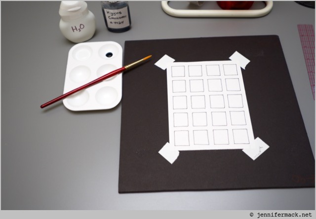
To do this exercise I started with a 4x5 grid. I lightly penciled the grid with a ruler, then inked over it. I also set up my palette tray with water and a few drops of black ink. (The white water bottle is a re-purposed drink flavor squirt bottle.)
Next I filled two columns with ink washes. I didn’t pre-mix three grays. I wanted to test my eye by mixing as I went. The second column is better then the first because I was able to get a lighter gray for the fourth value. I cheated a bit, in that I used the lightest gray from the first column and further diluted it. Then I worked upwards, darkening as I went.
It seems like working lightest to darkest is the way to go.
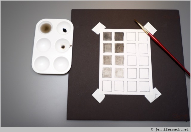
Now for the pen strokes. The third column is just horizontal hatching. The forth is diagonal crosshatching, which seems a bit easier to control for value.
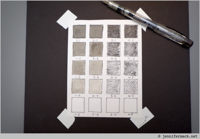
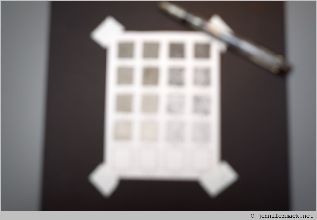
To best compare values, sometimes it’s better to squint so the details get blurred out. Or un-focus the camera! Now we can look at the values and see that overall I hit it pretty close when comparing columns two and four.
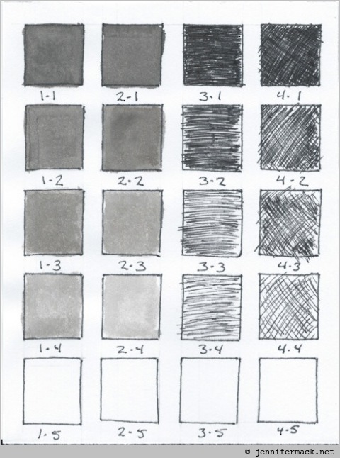
Here’s the high-resolution scan of the finished exercise. The pen strokes are visible, and you can see the difference between hatching and crosshatching. This also shows the ink to be black, as it has a brownish tinge in the photos.
This exercise is worth doing a few times. It might even be a good idea to do a value scale in margin of a larger drawing. That way we’d have something to refer to as the drawing progressed.
Tools used: Platinum Preppy fine point fountain pen, pencil, kneaded eraser, Higgins Calligraphy Ink, brush.
Chapter Review
Values are a basic building block for any pen drawing. Having a reference scale is handy, and provides a guide for future drawings. Going from a flat color to pen lines is odd transition. Our brain needs to be adjusted so that we don’t see the lines, only the overall value. This is easier with more practice.
I’ve never compared my line work to a ink wash value scale before. It let me see hatching values in a new way. I’m glad I didn’t skip over doing this exercise even if meant I had to go out and buy a brush. I also learned that ink washes are fun. I might explore that more in the future.